Cinematic Teal and Orange Look: Lighting Tutorial
 Jordy Vandeput
26K views
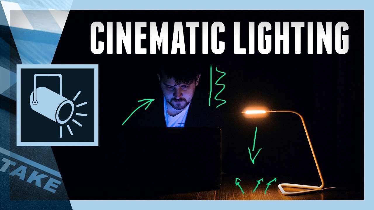
How to create a teal and orange look with a simple lighting setup. We'll cover indoor and outdoor techniques to achieve that cinematic look.
If you watched a movie in the last few years you probably noticed that there is a very popular and specific color scheme used in the blockbusters of today. This color scheme is called teal and orange and is widely used throughout the film making industry. It owes it's popularity through the simplicity and effects it creates.
Like the name already says, it all about Teal and Orange, two complementary colors. Which means that these two colors lie opposite to one another on the color wheel. Scientific research on color proved that some colors just look good together and are pleasing for the eye. Not only do they look good, but they also make each pop and create dynamic and contrast by popping. But why these complementary colors and not for example Red and Green.
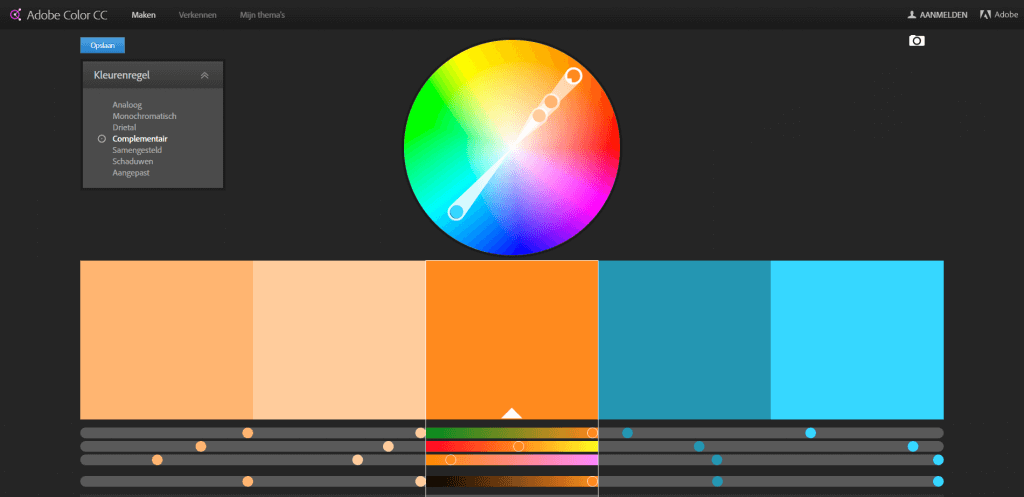
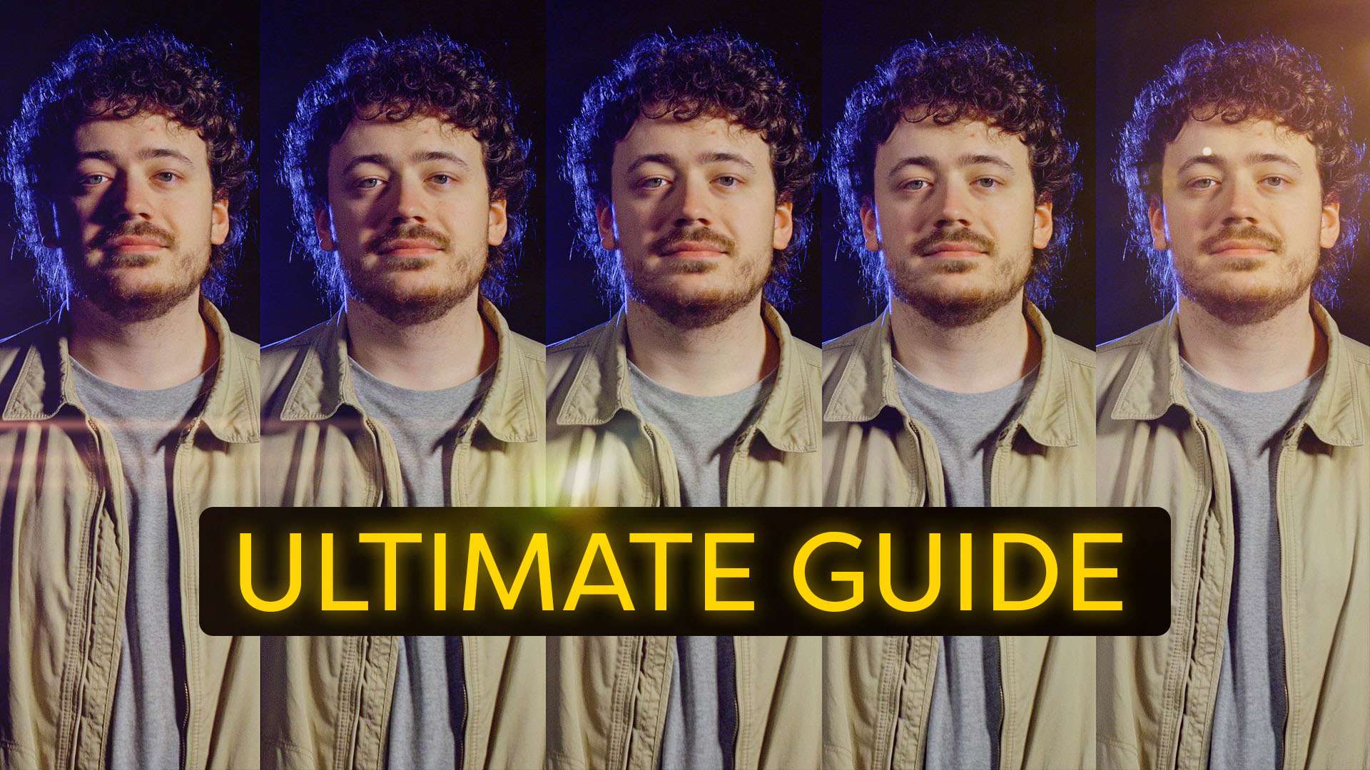
Skin tones are the reason behind this choice, because typically skin tones fall somewhere in the orange spectrum. So if you want to make you subject stand out and create that depth separating them from the background, you just push teal into your shadows and some orange in your midtones. This will create that depth and separation without having to use extra lights or depth of field. Not only will it create depth it will also create contrast, this is because blue and orange have the highest contrast between their exposure values of any pair of complementary colors.
The popularity of this color scheme has also a downside, because it's so popular it's being overused and getting over saturated. Every movie coming out and a lot of film enthusiasts are using it, it's a trend that is consuming the industry. This means that using this color grading scheme isn't original anymore and maybe is even becoming annoying. So make sure you are certain when you decide to use teal and orange in your video, because overusing it can destroy your film. A great example for this is Transformers 2, which received loads of criticism due to it's extreme color-look.

VideoBlocks
This video was supported by Videoblocks, an easy to use site full of stock footage, vector images, stock photos, music, sound effects and more.
Jordy Vandeput
Founder of Cinecom · 2.75M+ subscribers on YouTube
Jordy Vandeput is a Belgian filmmaker who has taught practical filmmaking to millions through Cinecom. He breaks professional techniques down into clear, repeatable steps you can use on your very next project.




1 comment
Love watching your tutorials! Well presented, filled with tips and tricks, and easily understood. Keep 'em coming!