Color Grade like a Super Hero Movie in premiere pro
 Jordy Vandeput
65K views
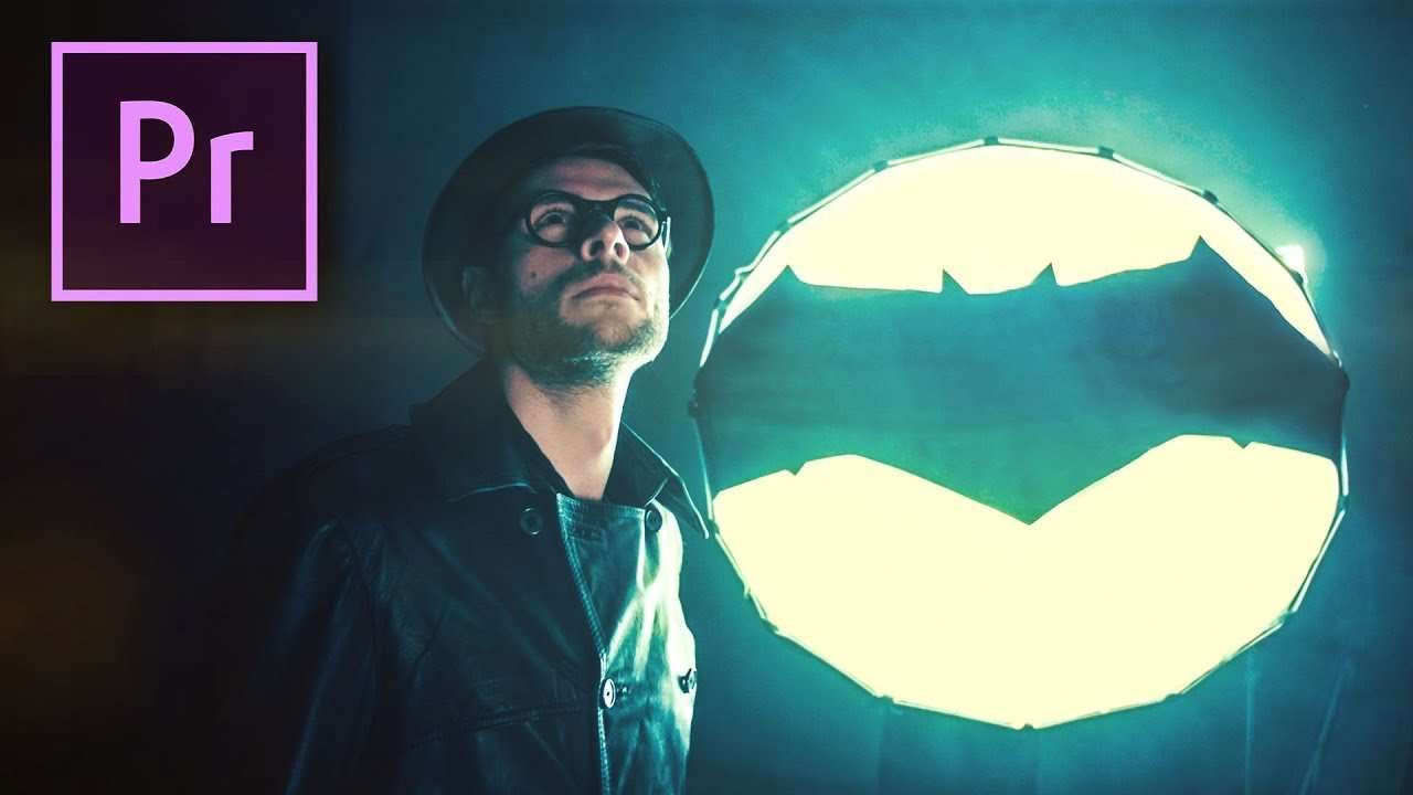
Create a cinematic Super hero look with these color grading techniques in Premiere Pro. Use Teal and Orange to create depth and contrast.
Super Hero's are super popular these days, with Marvel and DC as the leading hero factories. In the Comic book world they are both an established values and some what rivals. But in the movie industry marvel is the leading force when it comes to super hero's. However DC is coming with a counter offense. They just released the justice league, a super hero squad ready to save the world just like the Avengers from Marvel. This inspired us to make a tutorial how you can color grade like a super hero movie.
In our example we based ourself's on the Justice League. They use very vibrant colors and deep blacks to create more depth and contrast. Another technique they use for extra depth and contrast, is using teal in the shadows and orange in the mid-tones and highlights. These two colors are complementary, which means they are the opposite of each other in the color wheel. This technique is often used in Hollywood movies, because of the effects it creates. But you can ask yourself why don't you use other complementary colors? Well this is because of the skin-tones. These typically sit somewhere in the orange spectrum, so when u add blue/teal in your shadows it will make the skin-tones pop out. It's also believed that the teal and orange look recreates the golden hour feeling. This is when there is a sunrise or sunset, you'll have warm orange light against a blue cold sky.
It's not because nature and Hollywood uses it, you should too. Okay it's a beautiful color grading technique with stunning results. But you have to choose your grading in function of your movie, sometimes your content demands something completely different. A great example for this are war movies. Your content is dark and gloomy, so not fit for a teal and orange. In this case you can go for a desaturated look which reflects the suffering more.

Rocketstock Transition pack: Prism
Prism features 9 geometric transition styles, including circles, squares, waves, and much more. Easy to customize, these captivating 4K elements are a perfect match for filmmakers looking to give their work an instant hit of energy.
Jordy Vandeput
Founder of Cinecom · 2.75M+ subscribers on YouTube
Jordy Vandeput is a Belgian filmmaker who has taught practical filmmaking to millions through Cinecom. He breaks professional techniques down into clear, repeatable steps you can use on your very next project.




0 comments